
 Prior to nationalisation, and particularly prior to grouping in 1923, the railways in the United Kingdom were awash with different logos, typefaces and identities.
With the formation of British Railways in 1948 came the opportunity to standardise corporate image, and this lead to some of the most memorable, quintessential images of Britain’s railways that, despite multiple reorganisations along the way, persist to this day.
British Rail Typefaces

After the formation of British Railways in the late 1940s, a decision was taken by the Railway Executive (a division of the British Transport Commission) to use the Gill Sans typeface and this was rolled out across Great Britain on totems and station signage.
The fonts became an important component of the iconic and affectionately dubbed ‘flying sausage’ signs (with each region having a different background colour), but it wasn’t all that long until British Rail’s modernisation agenda called for another new, and this time very much simplified uniform identify.

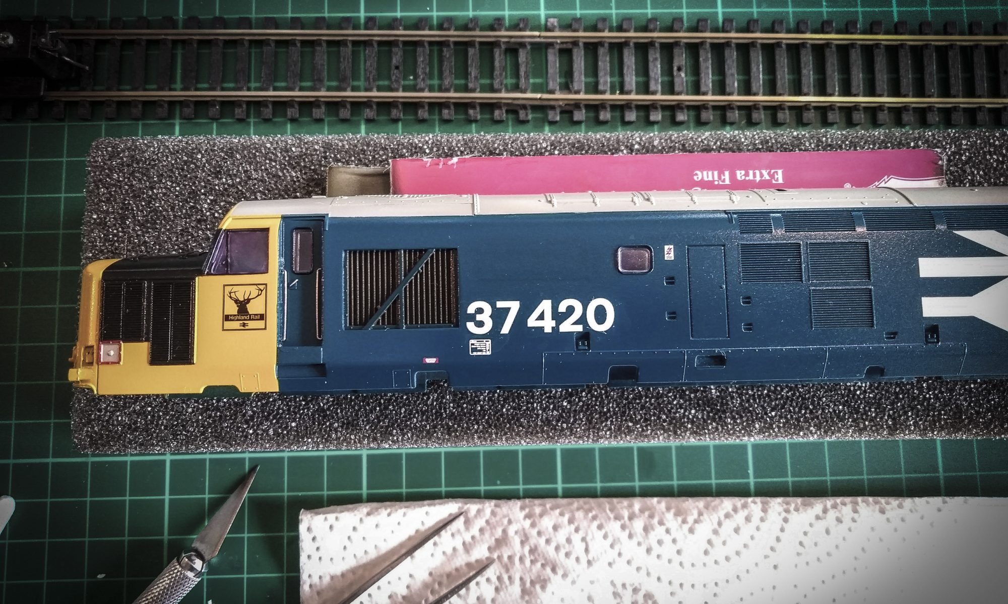
An eventual product of the Modernisation Plan, albeit a decade on, was the British Rail Corporate Identity Manual. This heralded in Gerald Barney’s now famous ‘double arrows’ symbol, alongside another new typeface that embraced the somewhat utilitarian industrial design styles of the otherwise swinging 60s: Rail Alphabet.

Rail Alphabet became the iconic typeface used by the British Rail all over Great Britain and at one stage was visible in almost every direction at every single station, depot and train in the land.
It was originally designed by Jock Kinneir and Margaret Calvert and was adopted by BR, alongside the classic Rail Blue colour, as part of the major re-branding exercise by the Design Research Unit. It was first used at Liverpool Street Station, before rolled out across the country in 1965.
 Rail Alphabet is similar, but not identical, to a bold weight of Helvetica and is related to the Transport typeface used for all road signs in the United Kingdom (also designed by Kinneir and Calvert). It was also used as part of the livery of Sealink ships prior to their privatisation and the National Health Service.

Despite it’s success and acclaim, nothing lasts forever – particularly in the corporate world. The typeface has been steadily phased out since privatisation in the late 1990s, but can still be seen in places around the network (including on track-side warning signs).
The original Rail Alphabet typeface was and remains a commercial product, however a free version of two similar fonts was devised by enthusiasts and made available a number of years ago via the Railways Archive website and others.
These fonts are a very close likeness to the original typeface and are ideal for a variety of railway modelling needs. A copy can be downloaded below as a zip file. As far as we are aware, whilst the original typeface Rail Alphabet remains copyrighted, these fonts are free to distribute for personal use.
★ British Rail Light Normal
★ British Rail Dark Normal
British Rail Fonts (Rail Alphabet) 39.61 KB 11987 downloads
Two British Rail-style fonts based on 'Rail Alphabet', as used by British Rail for...Want to find out more? There is an excellent article about Rail Alphabet (and the BR Corporate Identify Manual) on the Double Arrow website.
A copy of the Gill Sans MT font, as used by British Railways after the last war, can also be downloaded below as a zip file. As far as we are aware, the font is free to distribute for personal use.
★ Gill Sans MT
British Rail Font (Gill Sans) 42.17 KB 5699 downloads
The Gill Sans font, as used by British Railways on and around the UK's railways. ...Regional Railways

Regional Railways was one of the three passenger sectors of British Rail created in 1982 (the other two being InterCity and Network SouthEast). Alongside the organisational changes came a new logo and livery.
As a sector and brand, it existed until 1997, two years after privatisation. It was originally called Provincial and also continued the distinct trading name of ScotRail for all services operated in or from Scotland.
Joanna, the typeface used for Regional Railways, is a commercial typeface and is not available for free. There are, however, one or two free alternatives which can give reasonable results.
![]() A unicode version of one of the Joanna typeface fonts is available. This provides a reasonable likeness for normal and bold text in replicas of platform notices etc. However, it is not heavy enough for recreating the specially-drawn Regional Railways or ScotRail logos.
A unicode version of one of the Joanna typeface fonts is available. This provides a reasonable likeness for normal and bold text in replicas of platform notices etc. However, it is not heavy enough for recreating the specially-drawn Regional Railways or ScotRail logos.
If you wish to make up your own logos, you may wish to consider using the Jessica-Serial font. This is a fairly close match , but will require bold weighting and alterations to leading, tracking and some individual characters’ horizontal and vertical scales.
A zip file containing the following fonts is available. As far as we are aware, the fonts are free to distribute for personal use::
★ Unicode Joanna
★ Jessica-Serial
Regional Railways Font (Substitutes for Joanna) 98.16 KB 1866 downloads
Unicode Joanna and Jessica-Serial fonts: a relatively close match for the Joanna...Modern ScotRail Typefaces
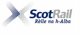 In September 2008, the Scottish Government’s transport agency, Transport Scotland, announced that the franchised Scottish rail services would be permanently renamed ScotRail and a new livery would be applied to all of Scotland’s trains and ScotRail-operated stations.
 For locomotives, multiple units and rolling stock, the new livery features a dark blue background, with grey doors and a white dotted ‘Saltire’ Scottish flag. For station names and general signage, dark blue becomes the predominant colour and is used alongside a new typeface called ITC Officina.
This ITC Officina font family is widely available for free download and four of its fonts are available here:
★ ITC Officina Std Book
★ ITC Officina Std Book Italic
★ ITC Officina Std Bold
★ ITC Officina Std Bold Italic
ScotRail ITC Officina Fonts 101.39 KB 1509 downloads
The font used for ScotRail since September 2008, when Transport Scotland announced...Please note: Images not otherwise in the public domain are reproduced here for the purposes of criticism or review.

You must be logged in to post a comment.